Pivot table is a table which summerise data of large database which includes some mathematical function like sum, average, count etc
Here we are taking a small example to learn Pivot Table in Excel
I have data of three company and its product, sell in 2018 and sell in 2019.
Step 1 Click on Insert tab
Step 2 Select Pivot Chart
Step 3 Select Pivot Chart & Pivot Table
Blank Pivot Chart1
The details of the headers of ther table
Here We have selcted all the four possible values from the pivot chart field
We have place Company in filter block
Same As
Product in Axis (Rows)
Sell in 2018 and sell in 2019 in Values Section
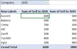
Step 7 Here you can see a analyzed data of cars of all the company

Here we are taking a small example to learn Pivot Table in Excel
I have data of three company and its product, sell in 2018 and sell in 2019.
Insert Pivot Table
Step 1 Click on Insert tab
Step 2 Select Pivot Chart
Step 3 Select Pivot Chart & Pivot Table
Step 4 A window Will Open
Choosing Data For Analyze
Select Table or Range
Here We have to choose Table or Range of table If you have selected a cell in the and after you apply Pivot Table Table name will appear automatically.
Otherwise, you can manually select the table by a range.
Use an external data source
If you have a table in another worksheet and you want pivot table in existing worksheet you can use this option
You just have to select the table from other worksheets.
Choosing the place where to Display Pivot chart
New Worksheet
If you want to your pivot chart to another worksheet you can use this option.
Existing Worksheet
If you want your pivot chart in the same worksheet use this option
Here we have a table automatically selected in the option and we want pivot table in new worksheet
so here we select New Work sheet
Then Click on Ok
Step 5
Ina new worksheet you can see a blank pivot tabel, blank chart 1 and in the right side of the sheet youcan see a Pivot Chart Field Window as shown below
Blank Pivot Table
Step 6 We have to select the fields we want to show or analyze on the pivot table
Here We have selcted all the four possible values from the pivot chart field
We have place Company in filter block
Same As
Product in Axis (Rows)
Sell in 2018 and sell in 2019 in Values Section
Step 7 Here you can see a analyzed data of cars of all the company

Step 8 Now you can change the selection of the company to view a specific compny sell
Here we have to click on the down arrow shown near(all) and select the company name of which we have analyze data
Step 9 Here you can see a Filtered data of Mahidra Company. You can apply it for on, two or more than two objects also
Step 10 You can short data by simply using right click on the column in which you want to short the data ande select the sort smallest to larhest or sort largest to smallest.
Will give you this result
we have apply short Smallest to Largest in second column
Step 11 Use right Click on the Column you want to summeries data
Here are Sum, Count, Min, Max, Product and more options are available
We have used max
Will give result
Here in the grand total the maximum valuf of the colum will show
Step 12 Pivot Chart of the data analyzed


No comments:
Post a Comment